Vienna’s old bus/tram stop sign on the left and new sign on the right.
UPDATE: 14 January 2021
Of course the Wiener Linien, the public transport company that makes Vienna the world’s most livable city, has very good reasons for the new signs. (I should have known given the overall excellent quality of the Wiener Linien public information.) I just saw a video about the Wiener Linien’s new signs on LinkedIn that describes their advantages:
- Signs designed with strong involvement of accessibility community;
- Barrier free (type size, contrast, audio information, big red post);
- Video displays that provide route information, schedules, transfer points, walking distances, changeable with an accessible button;
- Information consistent with the WienMobil Vienna multimodal trip planning app
As they say at the end of the video, the new signs provide more information, more comfort and are more barrier free. Again, the Wiener Linien shows why they are the leader in all things public transport. I can always see the old signs in the wonderful public transport museum Remise Vienna transport history museum.
ORIGINAL POST
The Viennese have a reputation in Austria of being grumpy (“grantig” in German). They are also, justifiably in many cases given the city’s beautiful historic buildings, parks and public spaces, not particularly enamored with change.
After living here 13+ years maybe I’m finally becoming Viennese. I’m really grantig about the new signs being used to designate bus and tram stops (Haltestelle).

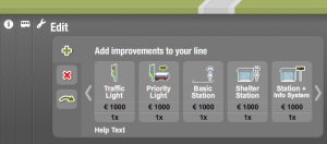
BusMeister game bus stop improvements panel.
The old signs are simple, low tech, instantly recognisable, useful (most have attached garbage cans as shown in the photo) and clear. Note how the old tram signs are oval and outlined in red while the bus signs are half-oval and outlined in blue. I was surprised that the game designers who created my BusMeister game actually knew this difference and incorporated the half-oval signs into the game. And, of course, the old low-tech signs are also consistent with Vienna’s historic feel.
The new signs just seem blocky (in contrast to the old signs’ simple elegance). Sure they include the real time display (which is on a separate pole at many stops with the old signs), they clearly show the stop name, and they use more up-to-date fonts, icons and corporate design. But, hey, I’ve become old fashioned.
There’s no question in my mind that the Wiener Linien (Vienna’s public transport company) is the finest public transport operator in the world, but I just wish they would keep the old signs!


0 Comments